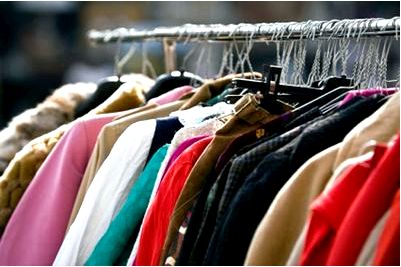
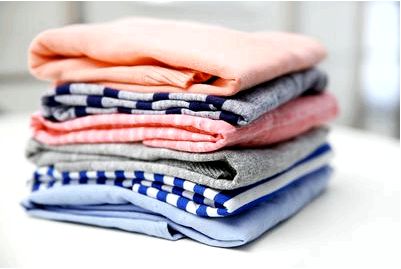
To date, there are a huge number of online shops around the world, among which there are excellent examples to follow.
When viewing a site with quality photos and competent content of the visitor’s interest in the store increases, the desire to buy something. The site, where product photos are presented in good quality and from different angles, is more credible than the one where one picture of the product, in addition, without the possibility of increasing. And if you are interested in how to properly photograph clothes, please follow the link —fashion product photography.

This article is intended for those who have not yet thought about the above. After all, despite the great variety of beautifully designed sites, there is still no less number of online stores, from the pages of which you want to escape as soon as possible. Perhaps our recommendations on how to photograph clothes and design a product page, will help online stores to become better and increase conversion.
What should be the clothes photos
To begin with, let’s give a small list of recommendations on how the clothes for sale in the photo should look like and what should be taken into account in the photos. Look into any major online clothing store and you will see that all of the following conditions are met. This is very helpful to the buyer in making their choice:
- Clothing must be clean and ironed.
- Clothing should not lie shapelessly.
- It is unacceptable to distort the shades in the photo — the color of the clothes should be as close to reality as possible.
- If the product exists in more than one color, photographs for each color are required.
- It is desirable to demonstrate the texture of fabric and details of the product.
- Place the pictures of clothes in different angles.
There’s nothing worse than a single picture of clothes in a product card. When you walk into a retail store and see the item you like, you’re sure to look at it from all angles, aren’t you? A visitor to an online store have the same desires, only he is in the worst position, because he does not have the opportunity to personally hold the thing in his hands and consider everything that interests him.
You need to make a review for him. Place the product pictures on the page in different angles: front and back (the minimum required). You can also (and should) take a picture of the model in half a turn and sitting. Show the best qualities of the thing on the pictures and remember that in this case it is impossible to overdo the pictures. On the contrary, the more pictures you take, the better.

Also, let the buyer estimate the size of the item. If it is a bag, you can fill it with ordinary items: notebook, phone, magazine, pen, perfume bottle, etc. before taking a picture of the inside of the bag.
Show small details
Be sure to take some pictures where you can see the texture of the fabric, important details, fittings. Do not hide from the eyes of the visitor and the inside of clothing, show the lining, pockets. The user should be able to enlarge the image and see all the details. Many popular online stores have a handy feature that allows you to view the enlarged part of the image when you hover over the photo.


